Suggestion for extra indicators/ flags on posts

Cubist

Senior Member
Joined
Oct 29, 2019
Messages
1,686
I think it would be helpful if the forum had a couple of extra indicators:-
  • where a post has resurrected an old thread - make this obvious (perhaps by adding a horizontal line or some kind of graphic)
  • where a follow-up post is from the OP. I can see which posters are currently online because a little green man is added to their avatar. Why not also add a small "OP" graphic to the avatar of the original poster. Many times I've manually scrolled to the top of a thread to check who the OP actually was (in threads where several new people become involved)
Comments are welcome!
 
I can see which posters are currently online because a little green man is added to their avatar.

I can only see them when I open a thread, but are they available in the list of threads, e.g. "New posts" ?
 
I think it would be helpful if the forum had a couple of extra indicators:-
  • where a post has resurrected an old thread - make this obvious (perhaps by adding a horizontal line or some kind of graphic)
  • where a follow-up post is from the OP. I can see which posters are currently online because a little green man is added to their avatar. Why not also add a small "OP" graphic to the avatar of the original poster. Many times I've manually scrolled to the top of a thread to check who the OP actually was (in threads where several new people become involved)
Comments are welcome!
These are excellent suggestions - however, we as moderators cannot add/subtract from the original "software" of the board.
 
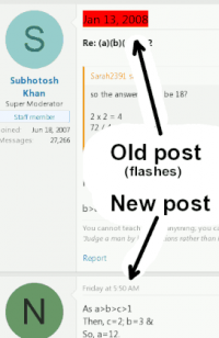
Here's a method to make old post dates really stand out...

Some browsers support "css injection" so that you can customise the appearance of websites. The following css makes the date text (in the header) of a post from a previous year stand out with a bigger font and a flashing background

hilight.png

Code:
    .message-inner time:not([data-date-string$="2022"]) {
        font-size: 20px !important; color: black !important; animation: blinkingBackground 2s infinite !important;
    }
    @keyframes blinkingBackground{   
        0%              { background-color: white;}         
        25%             { background-color: white;}         
        50%             { background-color: red;}           
        75%             { background-color: red;}           
        100%            { background-color: white;}         
    }
...obviously you have to (manually) update the 4 digit year every January.

In order to use this you might have to download a "CSS injection" plugin (make sure that it's a trusted plugin). The plugin should let you specify the website that you want to affect (so that other websites won't change their appearance).

IF you use Firefox then Google "userContent.css" for another way to do this. In "userContent.css" you can make sure that the above only affects freemathhelp.com site by putting this following code around the above...
Code:
@-moz-document domain(freemathhelp.com) {
...
}

I suspect that @blamocur might try this, being a fellow ?, but I suspect that no-one else will :ROFLMAO:
 
I've also found a way to keep the OP details on screen...

op.png

Append the following CSS to the advice in post#6...
Code:
    .p-description{
    color: black !important; position:fixed; left:350px; top:0px; z-index:400; background:white; padding:5px !important;
    }
    .p-description time:not([data-date-string$="2022"]){
        animation: blinkingBackground 2s infinite !important;
    }
 
Here's a method to make old post dates really stand out...

Some browsers support "css injection" so that you can customise the appearance of websites. The following css makes the date text (in the header) of a post from a previous year stand out with a bigger font and a flashing background

View attachment 33876

Code:
    .message-inner time:not([data-date-string$="2022"]) {
        font-size: 20px !important; color: black !important; animation: blinkingBackground 2s infinite !important;
    }
    @keyframes blinkingBackground{  
        0%              { background-color: white;}        
        25%             { background-color: white;}        
        50%             { background-color: red;}          
        75%             { background-color: red;}          
        100%            { background-color: white;}        
    }
...obviously you have to (manually) update the 4 digit year every January.

In order to use this you might have to download a "CSS injection" plugin (make sure that it's a trusted plugin). The plugin should let you specify the website that you want to affect (so that other websites won't change their appearance).

IF you use Firefox then Google "userContent.css" for another way to do this. In "userContent.css" you can make sure that the above only affects freemathhelp.com site by putting this following code around the above...
Code:
@-moz-document domain(freemathhelp.com) {
...
}

I suspect that @blamocur might try this, being a fellow ?, but I suspect that no-one else will :ROFLMAO:
This does look very useful but, unfortunately, did not work with my Firefox 104.0 :( Nothing suspicious popped up in the console, so I suspect that Firefox simply ignored my userContent.css :( Since I don't know enough about CSS I'll let it be for now, but still, thank you for an interesting bit of info.
 
This does look very useful but, unfortunately, did not work with my Firefox 104.0 :( Nothing suspicious popped up in the console, so I suspect that Firefox simply ignored my userContent.css :( Since I don't know enough about CSS I'll let it be for now, but still, thank you for an interesting bit of info.

Thanks for giving it a try :thumbup: I'm on an older version of Firefox at the moment, which might explain the difference.
 
Top