Probability
Full Member
- Joined
- Jan 26, 2012
- Messages
- 431
I've put this post in this section because I'm unsure where to post it. I thought about calculus but then thought that section is too advanced for what I'm learning.
I'm asked to construct a table of values for a formula f = 1.8c+32. The table I've calculated is;
c = (- 20), (0), (20), (40) This is in degrees C
f = (-4), (32), (68), (104)
I now know that (-20) degrees C is equivalent to (-4) degrees F etc.
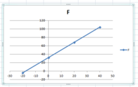
I was then asked to plot a graph using graph paper if I had any, so not having any I used the Excell spread sheet.
I was then asked to use the graph to make the following conversions.
10 degrees C to degrees F
-10 degrees C to degrees F
-10 degrees F to degrees C
0 degrees F to 0 degrees C
Looking at the table of data above and using the formula above I can work out the conversions. So lets assume for a minute that I don't have access to the formula and I don't know how to convert these temperatures. Can somebody please show me how using this graph I'm supposed to know what degrees F is equal to say 10 degrees C?
Now I look to the graph to convert 10 degrees C to degrees F. What I see here is a very inaccurate graph. If I now draw a vertical line from the (-c) axis to the blue line, and then draw another line from the (-f) axis to meet the vertical line, then based on the graph I could say that the equivalent temperature in degrees F is approx 50. This is completely wrong whereas I know the temperature should be 44 degrees F. Graphically examining the data its not reliable.
Without having to hand draw every graph there must be a better way using software to ensure that graphs produced are accurate for their intended purposes?
I'm asked to construct a table of values for a formula f = 1.8c+32. The table I've calculated is;
c = (- 20), (0), (20), (40) This is in degrees C
f = (-4), (32), (68), (104)
I now know that (-20) degrees C is equivalent to (-4) degrees F etc.
I was then asked to plot a graph using graph paper if I had any, so not having any I used the Excell spread sheet.
I was then asked to use the graph to make the following conversions.
10 degrees C to degrees F
-10 degrees C to degrees F
-10 degrees F to degrees C
0 degrees F to 0 degrees C
Looking at the table of data above and using the formula above I can work out the conversions. So lets assume for a minute that I don't have access to the formula and I don't know how to convert these temperatures. Can somebody please show me how using this graph I'm supposed to know what degrees F is equal to say 10 degrees C?

Now I look to the graph to convert 10 degrees C to degrees F. What I see here is a very inaccurate graph. If I now draw a vertical line from the (-c) axis to the blue line, and then draw another line from the (-f) axis to meet the vertical line, then based on the graph I could say that the equivalent temperature in degrees F is approx 50. This is completely wrong whereas I know the temperature should be 44 degrees F. Graphically examining the data its not reliable.
Without having to hand draw every graph there must be a better way using software to ensure that graphs produced are accurate for their intended purposes?
