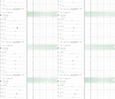
Drawing parametric waves (and learning maths with it)

haki

New member
Joined
May 16, 2020
Messages
4
Hey everybody,

As a personal challenge, I want to graph (ocean) waves in stylized, somewhat artistic way and thus better understand the maths begind it.
I started by plotting [MATH](t-sin(t)a, 1+cos(t)b)[/MATH]. Cool, that's a classic "garland".
desmos_wave_plot.png

And now it gets interesting: Well, how about barrel waves? What should I be looking at to make the peaks curl without looping over themselves? How would one 'scale' or 'skew' (for lack of terminology) the garland shape along x?

I can visualize what i'm after, i can't express it in maths terms. Any suggestions?
My intuition is that I need a funtion for the blue line below and then...with my math level, things become quite fuzzy here, do something to the sine wave. Done. :))
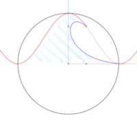
cos_squared_of_x.png

skewed_wave.png

Help point me in the right direction, anybody?
Cheers!
 
You can add "lumps" to these curves by adding (0.5+0.5*cos(t - <angle>))^p

By experimenting with this I got the following result:-

wave.png

x(t) = t − 0.8sin(t) + 1.5*(0.5+0.5*cos(t))^3
y(t) = 2 + 2cos(t) − 1.4*(0.5+0.5*cos(t−0.12))^8
 
Totally awesome! Time to play with this a bit...see what happens.
Thank you!
 
Note that it is much easier to use a vector drawing package to get a result like this. For example in "inkscape" you can repeat a pattern horizontally.

But it can be a good challenge, and a great learning exercise, to do something "the difficult way" sometimes. It can give you an intuition about the shape of an added term in an expression. Try plotting y=(0.5+0.5*cos(x - <angle>))^p for different angles and values of p. See if you can figure out why the various shapes occur. Perhaps try with p=100.
 
Well, my background is in software similar to inkscape (worked as a graphics designer for several years), so I know the artistic side, but I want to understand how things work (because it's interesting and i'm embarrassingly bad at the math behind that).

I have to write that using a graphing calculator is a challenge on its own.
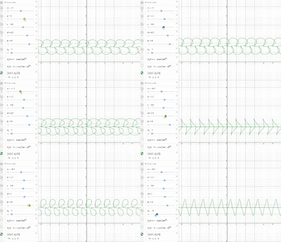
With what I have in the screenshot, it seems the green graph is rotating around y=0.5 (if it were the axis) when k1>k2 for different values of d. When k1<k2, the peaks are rotating each around regularly spaced apart x "axes" (but i think that's just because this is a 2D graph and the "rotation" is still along y anyway) and high k2 values flatten the bottom of the wave.

graph.png

I'll see if I can figure how to make d vary across time rather than be constant. see what happens then.

Thanks for your help, really! I appreciate that.

wave.png
 
It is probably best if you don't think in terms of rotation (for my solution). Rather, I gave the original peak a "kick" to the right (in x) and a kick downwards (in y) by using those extra, periodic, lumpy, terms!

To change the value of a constant from left to right then you can make a linear change with:-
[math] \left( c_{start} + (c_{end}-c_{start}) \left( \frac{t-t_{start}}{t_{end}-t_{start}} \right)\right) [/math]
...as t goes from \(t_{start}\) to \(t_{end}\) the expression's value goes from \(c_{start}\) to \(c_{end}\)

You probably noticed that reducing the value of "a" in your graph will help to smooth out the sharpness in the peak.

EDIT: Note that the above expression will simplify to something that looks like \( (c_1 + c_2*t) \), but in this form it's not as obvious what is going on!
 
Very cool! Thank you!

[MATH]\displaystyle \left( c_{start} + (c_{end}-c_{start}) \left( \frac{t-t_{start}}{t_{end}-t_{start}} \right)\right)[/MATH]
feel to me like a ..remapping function (pardon my terminology).

graph2.gif

I posted this earlier and I finally graphed it:

skewed_trochoidal.png


graph.gif

..except I can't seem to get the clean result on their picture:

wave_graph.png

[MATH]\displaystyle \left( c_{start} + (c_{end}-c_{start}) \left( \frac{t-t_{start}}{t_{end}-t_{start}} \right)\right)[/MATH]must be in there somewhere because the graph is changing from cycloid to skewed from left to right.

Cheers!
 
Top